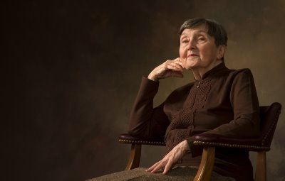
Portfolio portrait.

Finally, the first decent portrait I've managed to get for class. I think I'm finally starting to understand. Camera position is too low, so I'm shooting up her nose. Still, I'm very very pleased with the result. I'd appreciate any feedback.
Labels: aged, grandmother, low key portrait


2 Comments:
Beautiful light!! Well done on the lighting. I do agree that the camera angle is a little low; also, could her left shoulder be a bit lower?
This is a really nice portrait, Ham. Nice light. I think the pose works and the camera position isnt so bad that your client would be displeased..I think.
Post a Comment
<< Home